This is a second post in a series about making Firefox OS apps accessible to blind users. You could read the intro here, and a post about labels here.
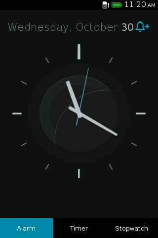
The Gaia Clock App has a pretty analog view, with ticking hands. You can stare at it and wonder how generations past were able to divine the time of day from a few muted lines. The analog clock should serve the same purpose for blind users as it does to sighted users: It should tell time. In this post I’ll give an overview of the steps I needed to take to make the analog clock view useful.

If you are a blind user,the screen reader won’t even bother telling you about the analog view. The view is composed from a collection of empty div elements. Since they don’t contain anything besides some special styling, the screen reader skips them and does not bother the user with some arbitrary nested divs. For a good reason, the entire Internet is a collection of redundant nested divs!
To make the screen reader display the view to the user, we need to give the view an appropriate role. This will tell the screen reader’s heuristics that the view is an item of interest. I chose to use the img role, since this is a graphic that describes time. There are other roles that would also be appropriate, such as marquee. But I chose img.
I applied this role on the clock’s container:
...
         <div role="tabpanel" id="alarm-panel" class="active panel">
           <div id="clock-view">
             <div id="analog-clock">
-              <div id="analog-clock-container">
+              <div id="analog-clock-container" role="img">
                 <div id="analog-clock-face">
                   <div id="analog-clock-hands">
                     <div class="analog-clock-hand" id="secondhand"></div>
...
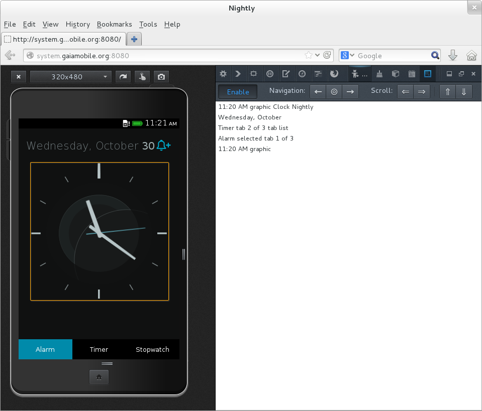
When I tried the screen reader with this change, I found that I was able to land on the analog view. The screen reader would say “graphic”, which is not very useful, but it is something. Now the user knows what is taking up all that space on the screen.
The next step is to label the graphic with the current time. This was done in Javascript. Every time the clock hands are updated, we update the ARIA label as well:
...
   updateAnalogClock: function cv_updateAnalogClock(opts) {
     opts = opts || {};
     if (opts.needsResize) {
       this.resizeAnalogClock();
     }
     var now = new Date();
     var sec, min, hour;
     sec = now.getSeconds();
     min = now.getMinutes();
     // hours progress gradually
     hour = (now.getHours() % 12) + min / 60;
     this.setTransform('second', sec);
     this.setTransform('minute', min);
     this.setTransform('hour', hour);
+
+    // Update aria label for analog view.
+    var time = Utils.getLocaleTime(now);
+    this.container.setAttribute('aria-label',
+                                time.t + (time.p ? ' ' : '') + time.p);
+
     // update again in one second
     this.timeouts.analog = setTimeout(
       this.updateAnalogClock.bind(this), 1000 - now.getMilliseconds()
     );
   },
...
Another round with the screen reader, it now says “11:20 AM, graphic”. That is a lot better!
