This is cross-posted from a Medium article by Akshitha Shetty, a Summer of Code student I have been mentoring. It’s been a pleasure and I wish her luck in her next endeavor!
For me, getting all set to read a book would mean spending hours hopping between stores to find the right lighting and mood to get started. But with Firefox’s Reader Mode it’s now much more convenient to get reading on the go. And this summer, I have been fortunate to shift roles from a user to a developer for the Reader Mode . As I write this blog, I have completed two months as a Google Summer of Code student developer with Mozilla. It has been a really enriching experience and thus I would like to share some glimpses of the project and my journey so far.
Motivation behind choosing this organization and project
I began as an open-source contributor to Mozilla early this year. What really impressed me was how open and welcoming Mozillians were. Open-source contribution can be really intimidating at first. But in my case, the kind of documentation and direction that Mozilla provided helped me steer in the right direction really swiftly. Above all, it’s the underlying principle of the organization — “people first” that truly resonated with me. On going through the project idea list, the “Firefox Reader Mode Revamp” was of great interest to me. It was one of the projects where I would be directly enhancing the user-experience for Firefox users and also learning a lot more about user-experience and accessibility in the process.
Redesign of the Reader mode in making
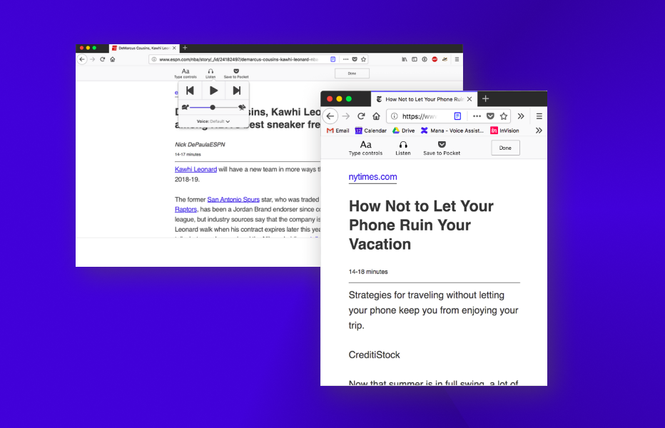
The new design of the reader mode has the following features -
- A vertical toolbar is to replaced by a horizontal toolbar so that it is the sync with the other toolbars present in Firefox.
- The toolbar is now being designed so that it complies with the Photon Design System (the latest design guidelines proposed by the organization).
- The accessibility of the Reader Mode is being improved by making it keyboard friendly.
 Mock-up for Reader Mode Redesign
Thanks to Abraham Wallin for designing the new UI for the Reader mode.
Get Set Code
Once the design was ready, I began with the coding of the UI. I thoroughly enjoyed the process and learnt a lot from the challenges I faced during this process. One of the challenges I faced during this phase was to make the toolbar adjust it’s width as per the content width of the main page. This required me to refactor certain portions of the existing code base as well make sure the newly coded toolbar follows the same.
To Sum it all up
All in all, it has been a really exciting process. I would like to thank my mentor — Eitan Isaacson for putting in the time and effort to mentor this project. Also I would like to thank — Gijs Kruitbosch and Yura Zenevich for reviewing my code at various points of time.
I hope this gets you excited to see the Reader Mode in its all new look ! Stay tuned for my next blog where I will be revealing the Revamped Reader Mode into action.